
搜索到
1
篇与
Python
的结果
-
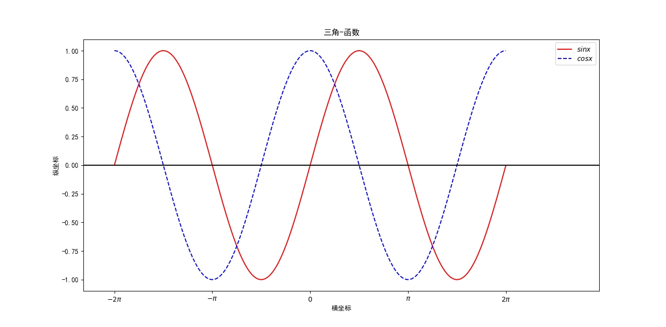
 Python绘图 Python有很多可视化工具,本篇只介绍Matplotlib和Seaborn。Matplotlib针对python不显示汉字解决方案import matplotlib.pyplot as pltplt.rcParams['font.sans-serif']=['SimHei']在绘图结构中,figure创建窗口,subplot创建子图。所有的绘画只能在子图上进行。plt表示当前子图,若没有就创建一个子图。Figure:面板(图),matplotlib中的所有图像都是位于figure对象中,一个图像只能有一个figure对象。Subplot:子图,figure对象下创建一个或多个subplot对象(即axes)用于绘制图像。配置参数figure: 控制dpi、边界颜色、图形大小、和子区( subplot)设置font: 字体集(font family)、字体大小和样式设置grid: 设置网格颜色和线性legend: 设置图例和其中的文本的显示line: 设置线条(颜色、线型、宽度等)和标记savefig: 可以对保存的图形进行单独设置。例如,设置渲染的文件的背景为白色。xticks和yticks: 为x,y轴的主刻度和次刻度设置颜色、大小、方向,以及标签大小。线条相关属性标记设置线形:linestyle或ls'-' : 实线'--' : 虚线'None',' ','' : 什么都不画'-.' : 点划线点型:maker'o' :圆圈'.' :点'D' :菱形's' :正方形'h' :六边形1'*' :星号'H' :六边形2'd' :小菱形'_' :水平线'v' :一角朝下的三角形'8' :八边形'<' :一角朝左的三角形'p' :五边形'>' :一角朝右的三角形',' :像素'^' :一角朝上的三角形'+' :加号'' :竖线'None',' ','' : 无'x' :X颜色:b:蓝色 g:绿色 r:红色 y:黄色 c:青色 k:黑色 m:洋红色 w:白色线图 plot()import numpy as np import matplotlib.pyplot as plt plt.rcParams['font.sans-serif'] = ['SimHei'] # 解决中文显示问题-设置字体为黑体 plt.rcParams['axes.unicode_minus'] = False # 解决保存图像是负号'-'显示为方块的问题 x = np.arange(-2*np.pi, 2*np.pi, 0.01) y1 = np.sin(x) y2 = np.cos(x) plt.figure(figsize=(10, 7)) plt.plot(x, y1 ,'r-',label='$sinx$') plt.plot(x, y2 ,'b--',label='$cosx$') plt.legend(loc='upper right') plt.xlim(-2*np.pi-1, 2*np.pi+3) plt.xticks([-2*np.pi, -np.pi, 0, np.pi, 2*np.pi], ['$-2\pi$', '$-\pi$', '$0$', '$\pi$', '$2\pi$']) plt.title('三角-函数') plt.xlabel('横坐标') plt.ylabel('纵坐标') plt.axhline(y=0, c='black') plt.show() plot()参数plot([x], y, [fmt], data=None, **kwargs)可选参数[fmt] 是一个字符串来定义图的基本属性如:颜色(color),点型(marker),线型(linestyle),具体形式 fmt = 'color[line]'fmt接收的是每个属性的单个字母缩写,例如:plot(x, y, 'bo-') # 蓝色圆点实线散点图# 散点图 import matplotlib.pyplot as plt plt.rcParams['font.sans-serif']=['SimHei'] #显示中文 fig = plt.figure(figsize=(6,5)) x = [1.5, 1, 1, 2, 2, 3, 3, 4, 4, 5, 5] y = [6, 7, 8, 5, 9, 4, 9.5, 3, 9.5, 2, 9] x1 = [6, 6, 7, 7, 8, 8, 9, 9, 10, 10, 10.5, 11, 11] y1 = [1, 8, 2, 9, 3, 9, 4, 9.5, 5, 9, 6, 7, 8] plt.scatter(x, y, color='r', label='左心房') plt.scatter(x1, y1, color='b', label='右心房') plt.title('love') plt.legend() plt.show()条形图import matplotlib import matplotlib.pyplot as plt import numpy as np labels = ['Monday','Tuesday','Friday','Sunday'] men_means = [1.5,0.6,7.8,6] women_means = [1,2,3,1] x = np.arange(len(labels)) # the label locations width = 0.35 # the width of the bars fig, ax = plt.subplots() rects1 = ax.bar(x - width/2, men_means, width, label='boy') rects2 = ax.bar(x + width/2, women_means, width, label='girl') # Add some text for labels, title and custom x-axis tick labels, etc. ax.set_ylabel('Scores') #标题 ax.set_title('Scores by group and gender') #标题 ax.set_xticks(x) ax.set_xticklabels(labels) ax.legend() def autolabel(rects): """Attach a text label above each bar in *rects*, displaying its height.""" for rect in rects: height = rect.get_height() ax.annotate('{}'.format(height), xy=(rect.get_x() + rect.get_width() / 2, height), xytext=(0, 3), # 3 points vertical offset textcoords="offset points", ha='center', va='bottom') autolabel(rects1) autolabel(rects2) fig.tight_layout() plt.show() import matplotlib import matplotlib.pyplot as plt import numpy as np labels = ['Monday','Tuesday','Friday'] men_means = [1.5,0.6,7] women_means = [1,2,3] child=[1,1,2] x = np.arange(len(labels)) # the label locations width = 0.35 # the width of the bars fig, ax = plt.subplots() rects1 = ax.bar(x - 3*width/4, men_means, 3*width/4, label='boy') rects2 = ax.bar(x, women_means,3*width/4, label='girl') rects3 = ax.bar(x + 3*width/4, child, 3*width/4, label='child') # Add some text for labels, title and custom x-axis tick labels, etc. ax.set_ylabel('Scores') #标题 ax.set_title('Scores by group and gender') #标题 ax.set_xticks(x) ax.set_xticklabels(labels) ax.legend() def autolabel(rects): """Attach a text label above each bar in *rects*, displaying its height.""" for rect in rects: height = rect.get_height() ax.annotate('{}'.format(height), xy=(rect.get_x() + rect.get_width() / 2, height), xytext=(0, 3), # 3 points vertical offset textcoords="offset points", ha='center', va='bottom') autolabel(rects1) autolabel(rects2) autolabel(rects3) fig.tight_layout() plt.show()直方图直方图与条形图基本类似,不过直方图通常用来对单个数据的单一属性进行描述,而不是用于比较data:必选参数,绘图数据bins:直方图的长条形数目,可选项,默认为10 normed:是否将得到的直方图向量归一化,可选项,默认为0,代表不归一化,显示频数。normed=1,表示归一化,显示频率。facecolor:长条形的颜色edgecolor:长条形边框的颜色alpha:透明度import matplotlib.pyplot as plt plt.rcParams['font.sans-serif'] = ['SimHei'] # 中文显示 plt.rcParams['axes.unicode_minus']=False # 正常显示负号 import numpy as np data = np.random.randn(10000) plt.hist(data, bins=40, normed=0, facecolor='blue', edgecolor='black', alpha=0.7) plt.xlabel('区间') plt.ylabel('频数') plt.title('频数分布直方图') plt.show()饼图x :(每一块)的比例,如果sum(x) > 1会使用sum(x)归一化;labels :(每一块)饼图外侧显示的说明文字;explode :(每一块)离开中心距离;startangle :起始绘制角度,默认图是从x轴正方向逆时针画起,如设定=90则从y轴正方向画起;shadow :在饼图下面画一个阴影。默认值:False,即不画阴影;autopct :控制饼图内百分比设置,可以使用format字符串或者format function '%1.1f'指小数点前后位数(没有用空格补齐);import matplotlib.pyplot as plt plt.rcParams['font.sans-serif'] = ['SimHei'] # 中文显示 plt.rcParams['axes.unicode_minus']=False # 正常显示负号 labels = ['育儿','饮食','房贷','其他'] x = [5,12,50,9] explode = (0,0,0.01,0) #0.01调整中间空格大小 plt.pie(x,labels=labels,explode=explode,autopct='%1.1f%%') plt.title('家庭支出比例') plt.show()import numpy as np import matplotlib.pyplot as plt fig, ax = plt.subplots(figsize=(6, 3), subplot_kw=dict(aspect="equal")) recipe = ["375 g flour", "75 g sugar", "250 g butter", "300 g berries"] data = [float(x.split()[0]) for x in recipe] ingredients = [x.split()[-1] for x in recipe] def func(pct, allvals): absolute = int(pct/100.*np.sum(allvals)) return "{:.1f}%\n({:d} g)".format(pct, absolute) wedges, texts, autotexts = ax.pie(data, autopct=lambda pct: func(pct, data), textprops=dict(color="w")) ax.legend(wedges, ingredients, title="Ingredients", loc="center left", bbox_to_anchor=(1, 0, 0.5, 1)) plt.setp(autotexts, size=8, weight="bold") ax.set_title("Matplotlib bakery: A pie") plt.show()import numpy as np import matplotlib.pyplot as plt fig, ax = plt.subplots(figsize=(6, 3), subplot_kw=dict(aspect="equal")) recipe = ["225 g flour", "90 g sugar", "1 egg", "60 g butter", "100 ml milk", "1/2 package of yeast"] data = [225, 90, 50, 60, 100, 5] wedges, texts = ax.pie(data, wedgeprops=dict(width=0.5), startangle=-40) bbox_props = dict(boxstyle="square,pad=0.3", fc="w", ec="k", lw=0.72) kw = dict(arrowprops=dict(arrowstyle="-"), bbox=bbox_props, zorder=0, va="center") for i, p in enumerate(wedges): ang = (p.theta2 - p.theta1)/2. + p.theta1 y = np.sin(np.deg2rad(ang)) x = np.cos(np.deg2rad(ang)) horizontalalignment = {-1: "right", 1: "left"}[int(np.sign(x))] connectionstyle = "angle,angleA=0,angleB={}".format(ang) kw["arrowprops"].update({"connectionstyle": connectionstyle}) ax.annotate(recipe[i], xy=(x, y), xytext=(1.35*np.sign(x), 1.4*y), horizontalalignment=horizontalalignment, **kw) ax.set_title("Matplotlib bakery: A donut") plt.show()Seaborn线图plot()import numpy as np import matplotlib.pyplot as plt import seaborn as sns plt.rcParams['font.sans-serif'] = ['SimHei'] # 中文字体设置-黑体 plt.rcParams['axes.unicode_minus'] = False # 解决保存图像是负号'-'显示为方块的问题 sns.set(font='SimHei') # 解决Seaborn中文显示问题 x = np.arange(-2*np.pi, 2*np.pi, 0.01) y1 = np.sin(x) y2 = np.cos(x) plt.figure(figsize=(10, 7)) plt.plot(x, y1,'r-',label='$sinx$') plt.plot(x, y2,'b--',label='$cosx$') plt.legend(loc='upper right') plt.xlim(-2*np.pi-1, 2*np.pi+3) plt.xticks([-2*np.pi, -np.pi, 0, np.pi, 2*np.pi], ['$-2\pi$', '$-\pi$', '$0$', '$\pi$', '$2\pi$']) plt.title('三角-函数') plt.xlabel('横坐标') plt.ylabel('纵坐标') plt.axhline(y=0, c='black') plt.show()直方图import numpy as np import matplotlib.pyplot as plt import seaborn as sns plt.rcParams['font.sans-serif'] = ['SimHei'] # 中文显示 plt.rcParams['axes.unicode_minus']=False # 正常显示负号 sns.set(font='SimHei') # 解决Seaborn中文显示问题 np.random.seed(sum(map(ord, "distributions"))) x = np.random.normal(size=100) sns.distplot(x) plt.xlabel('区间') plt.ylabel('频数') plt.title('频数分布直方图') plt.show()